The form stopped being a questionnaire. Now it is a conversation.
The before and after of this site's contact form: from one long page, the same for everyone, to four short steps that follow the service chosen, write the summary of the brief and say what is missing before sending. Done in one afternoon.
The contact form is usually the least designed part of a website, and it is the one closest to the client. It is where someone decides to write or to close the page. Mine was like nearly all of them: a list of fields. Today it stopped being one.
This article shows the before and the after, change by change, and says why each one is there. You can try the form as you read.
Before: one questionnaire, the same for everyone
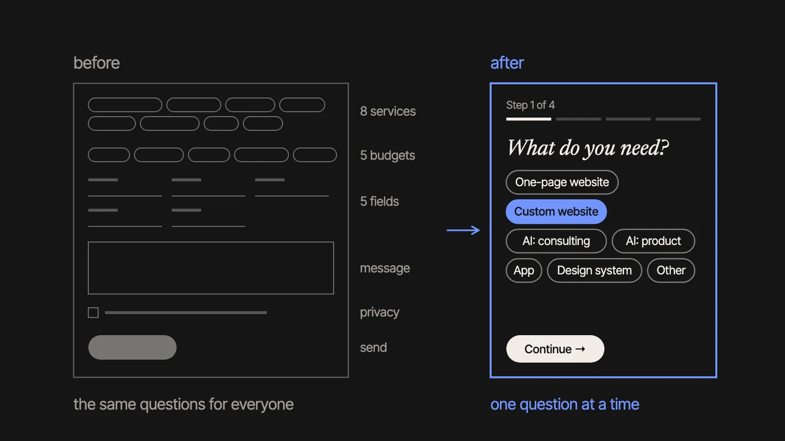
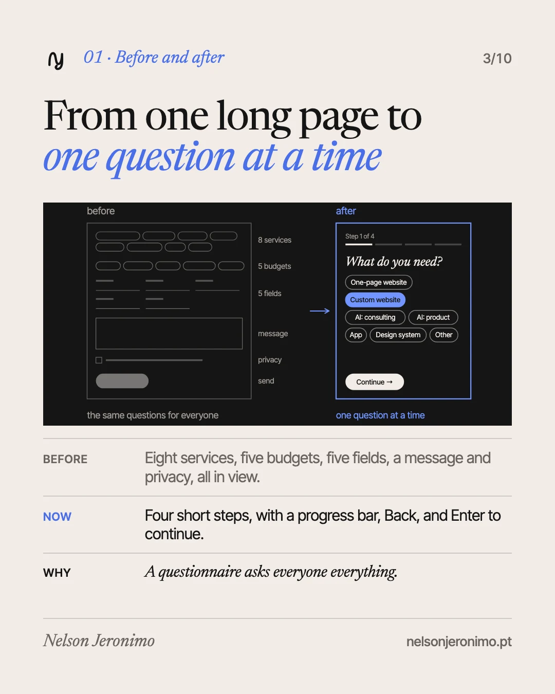
It was one long page with everything in view: several kinds of service, five budget ranges, name, email, company, phone, current website, a box for the message, the privacy policy acceptance and the send button. Someone who wanted AI consulting saw the same questions as someone who wanted an app.
It worked. But it was a questionnaire: it asked everything, of everyone, in the same order.
The summary, in a table
| Before | Now | |
|---|---|---|
| Structure | One page with every field | Four short steps, with a progress bar |
| Questions | The same for everyone | They follow the service chosen |
| Budget | Always asked | Skipped when the price is already known |
| The brief | Loose fields | A summary that writes itself as you fill things in |
| Email and website | Typed without help | Endings offered, slips caught, domain ideas |
| Leaving the page | What was typed was lost | The draft stays in your browser |
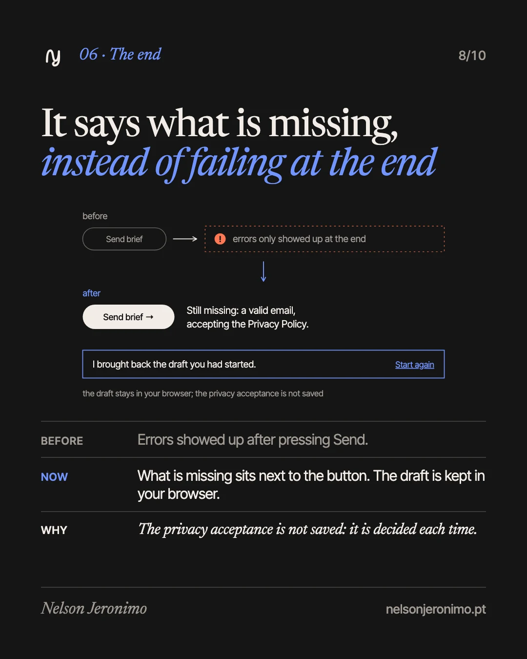
| Errors | Showed up at the end | What is missing sits next to the button |
1. Four short steps, and one that gets skipped
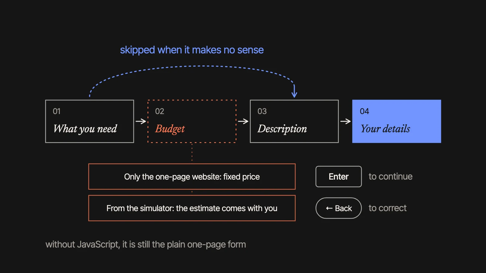
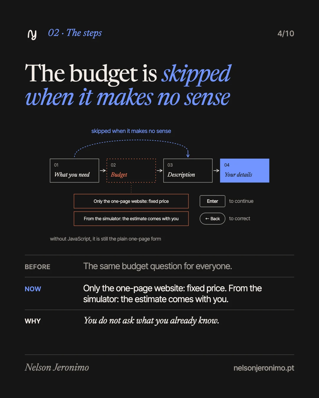
The form now has four steps: what you need, the budget, the description and your contact details. A bar shows which step you are on, there is a Back button and the Enter key moves on. Without JavaScript it is still the plain one-page form: nothing stops working.
The budget step is skipped when it makes no sense. Someone who picks only the one-page website sees that the price is fixed. Someone who arrives from the price simulator brings the estimate with them, and it is already in the brief.
The reason: you do not ask what you already know.
2. The questions follow the service
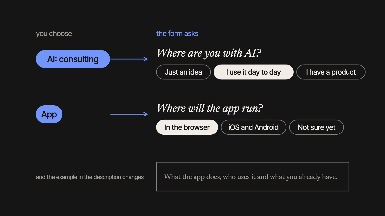
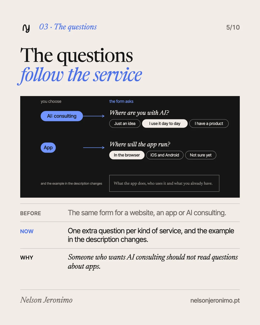
Each kind of service brings one extra question, and only that one. For AI consulting: “Where are you with AI?”. For an app: “Where will the app run?”. For a website: “Do you already have text and images?”.
The example text in the description box changes too. Someone who picks an app reads “What the app does, who uses it and what you already have.”; someone who picks AI consulting reads something else.
The reason: these are the questions I would ask in the first email anyway. Asked here, the conversation starts further along.
3. The summary writes itself
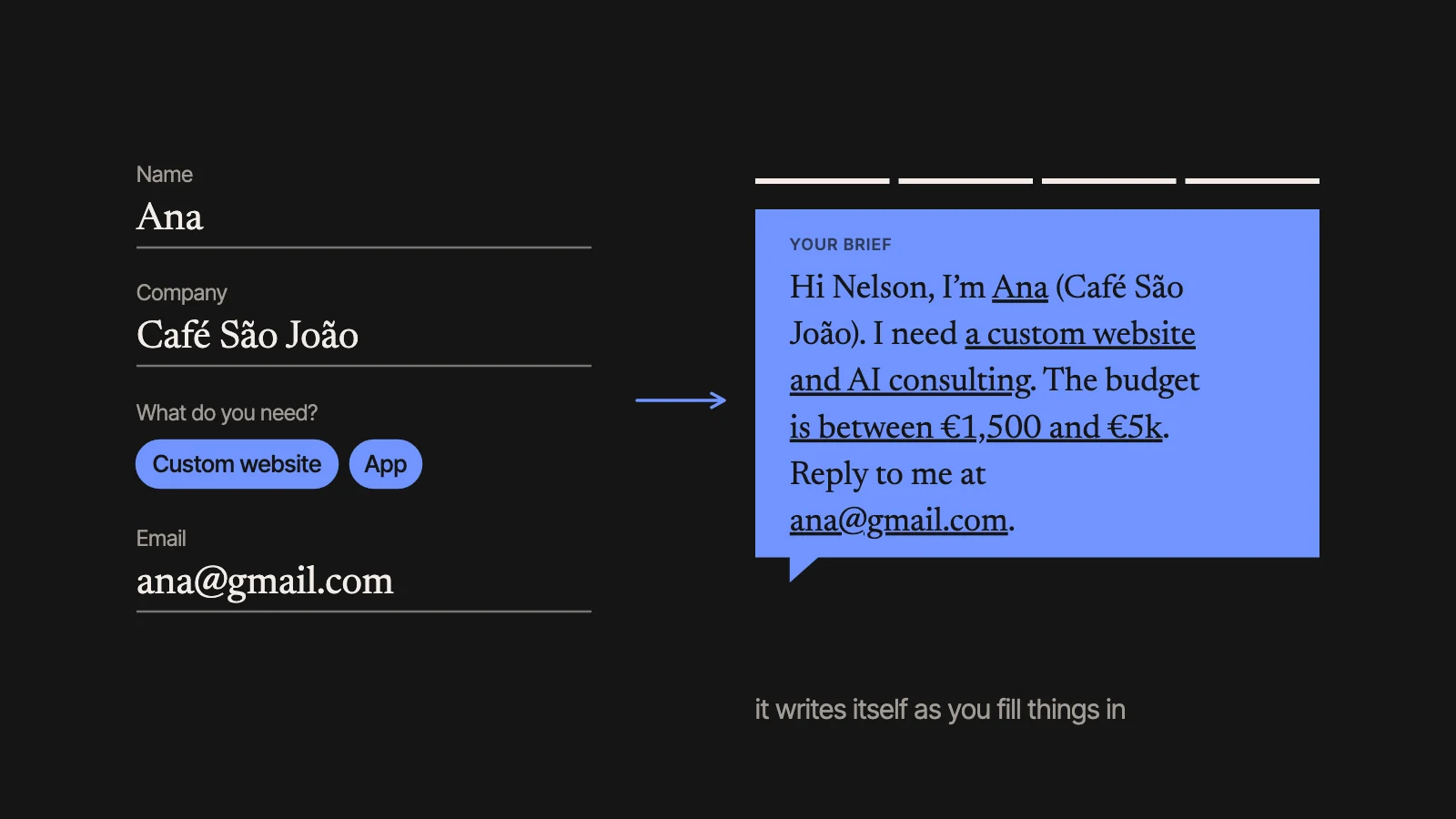
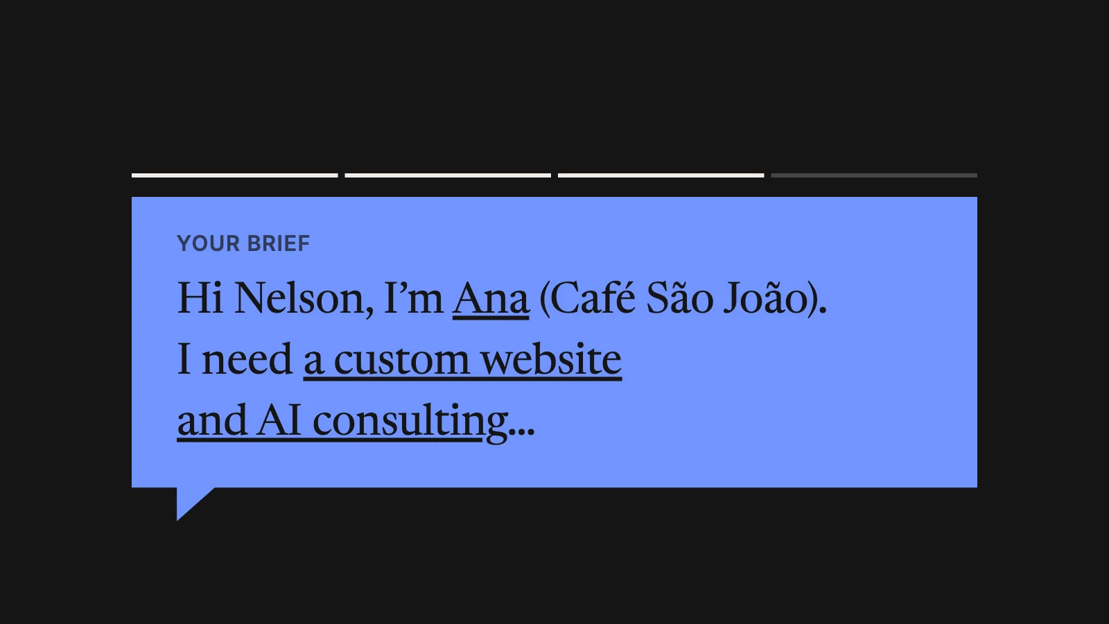
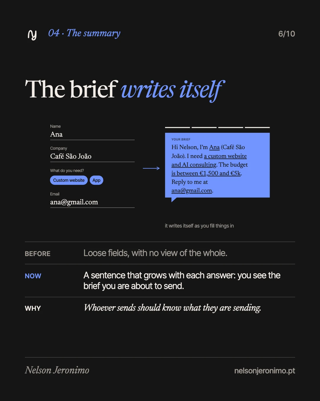
Next to the fields there is a summary that grows with each answer. With an example: “Hi Nelson, I’m Ana (Café São João). I need a custom website and AI consulting…” What is still missing shows in brackets, fainter, until it is filled in.
You stop seeing loose fields and start seeing the brief you are about to send, written the way you would write it to someone.
The reason: whoever sends should know what they are sending.
4. Help where people slip
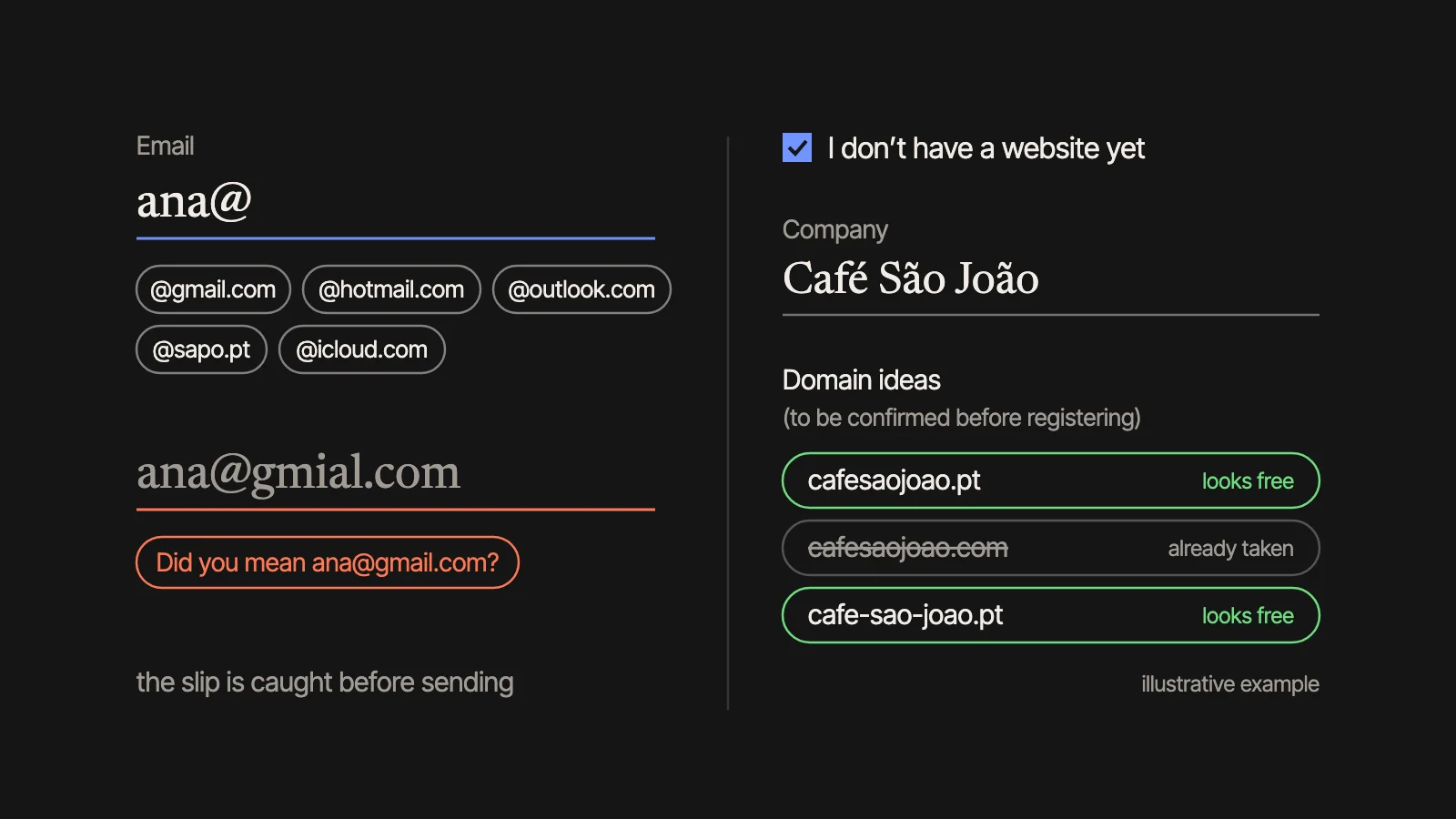
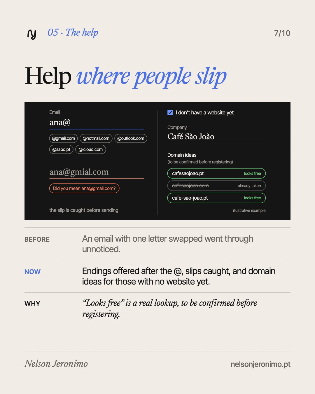
In the email. After the @, the form offers the most common endings (gmail.com, hotmail.com, outlook.com, sapo.pt, icloud.com) and catches the usual swapped letters: “Did you mean ana@gmail.com?”.
In the website. The current website field gained the option “I don’t have a website yet”. Ticking it brings domain ideas made from the company name, each marked “looks free” or “already taken”. The lookup is real, but it is not a guarantee, and the form says so: “to be confirmed before registering”.
The reason: an email with one letter swapped is a brief I cannot answer.
5. Nothing is lost, nothing fails at the end
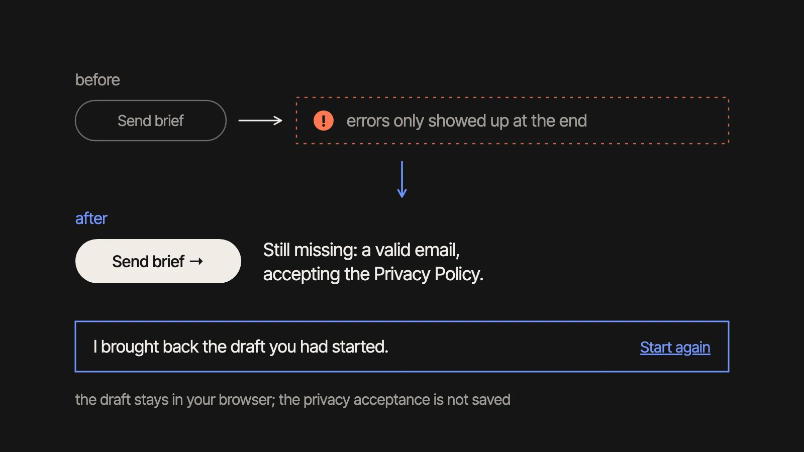
The draft is kept in your own browser until you send the brief. If you leave the page and come back, it is there, with a notice and the option to start again. The privacy policy acceptance is not saved, on purpose: that one is decided each time.
Next to the send button it says what is still missing (“Still missing: a valid email.”), instead of an error after pressing it. After sending, the confirmation shows the summary and what happens next, and the automatic reply email repeats what was asked for.
Measured without cookies, and no results yet
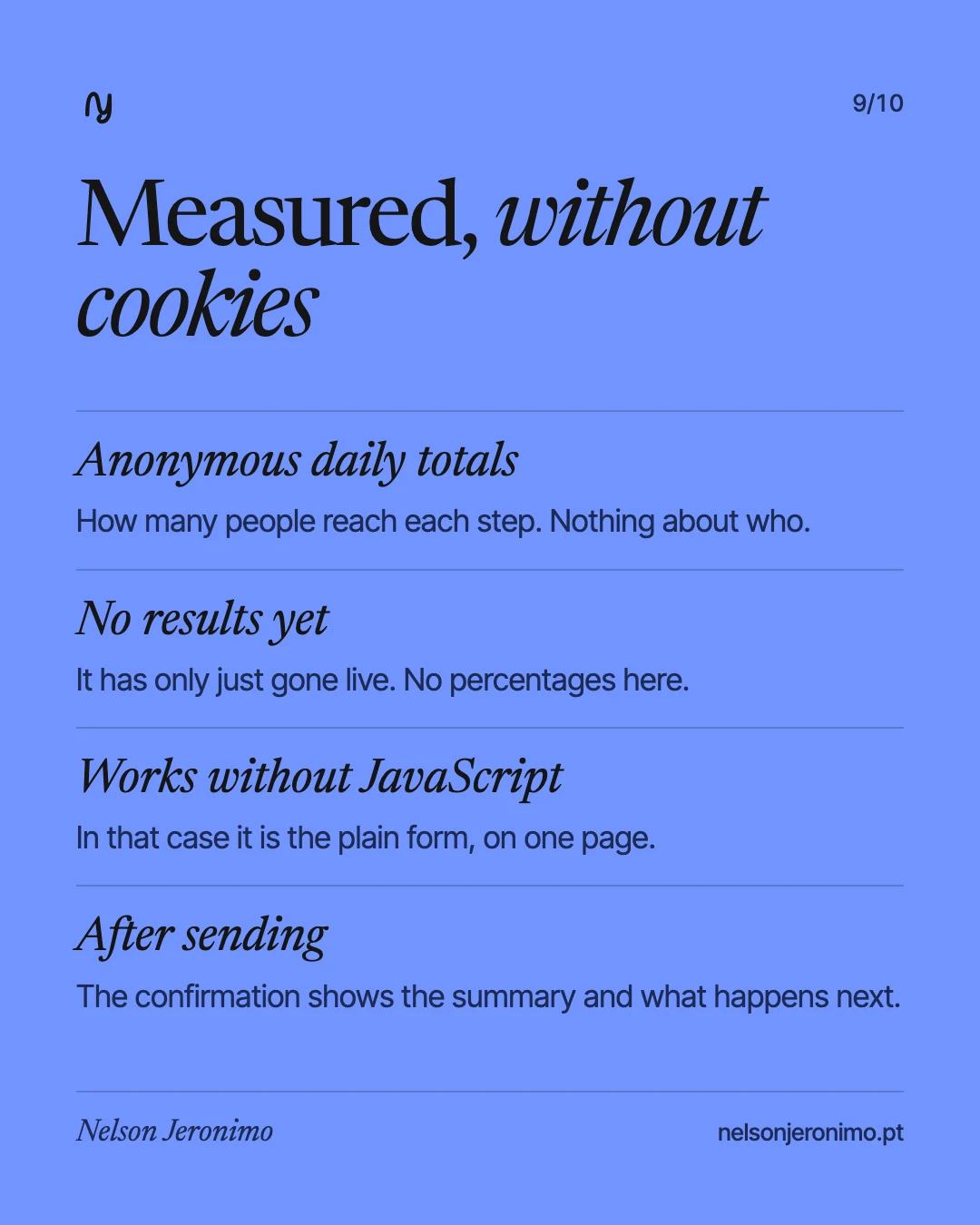
The form counts how many people reach each step. These are anonymous daily totals: no cookies and nothing about who is visiting. They are there to show where the form can keep improving.
There are no results yet. The form went live today, which is why this article has no percentages and no conversion rates.
One afternoon
All of this was asked for, built, tested and published in one afternoon, in both styles of the site (Classic and Modern) and in both languages. A few years ago, a form like this was a project: design, program by hand, test, fix, and each stage with its own wait.
It is what I mean when I write on the home page: “A website is no longer static. It is a living organism, changing at the pace of your ideas.” What to ask, of whom and in what order was still my decision. Execution is what stopped being the slow part.
The quickest way to see the difference is to use it: talk to me.