Where Claude Code helps me every day: on the design system and on the product screens.
I work with Claude Code connected to Figma every day. Where it helps in building the design system (tokens, a 4-point grid, components) and in using it on the product screens: screens, edge cases, audits, critiques, handoffs and prototypes. And what I had to correct.
I work with Claude Code connected to Figma every day. It reads the file, writes to it and counts what is there. This article says where that help comes in: first in building the design system, then in using it on the screens of the brand’s products, the LMS and the ICP.
The project where I use it most is SkillUp’s, a B2B e-learning platform where I am responsible for product design and for the design system, across several brands. I am not showing product screens: the drawings are diagrams, with made-up examples.
Where it helps, in a table
| Where | What I ask of it | What stays with me |
|---|---|---|
| Tokens | Write the missing ones and rebind the components | The names and the layers |
| Grid | Find the values off the scale | The scale |
| Components | Count usage, move to the library, cut variants | What goes into the library |
| Screens | Tablet and mobile, and every state | The content and the hierarchy |
| Checking | Audits and critiques | What gets corrected, and how |
| Delivery | Handoffs and prototypes | What goes to development |
In building the design system
Tokens: the foundation it respects
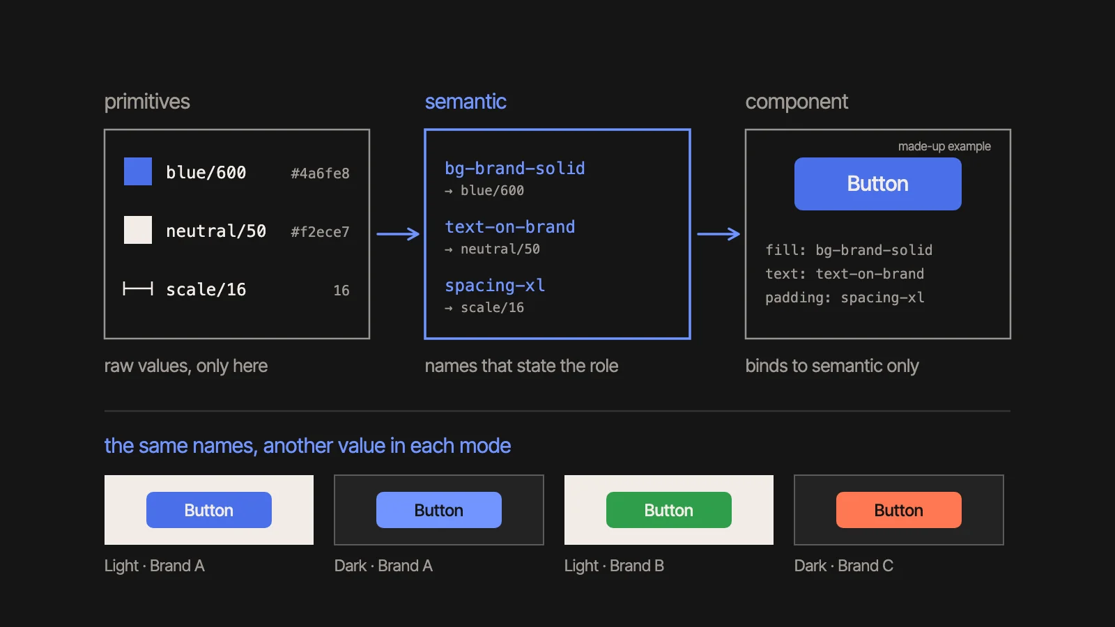
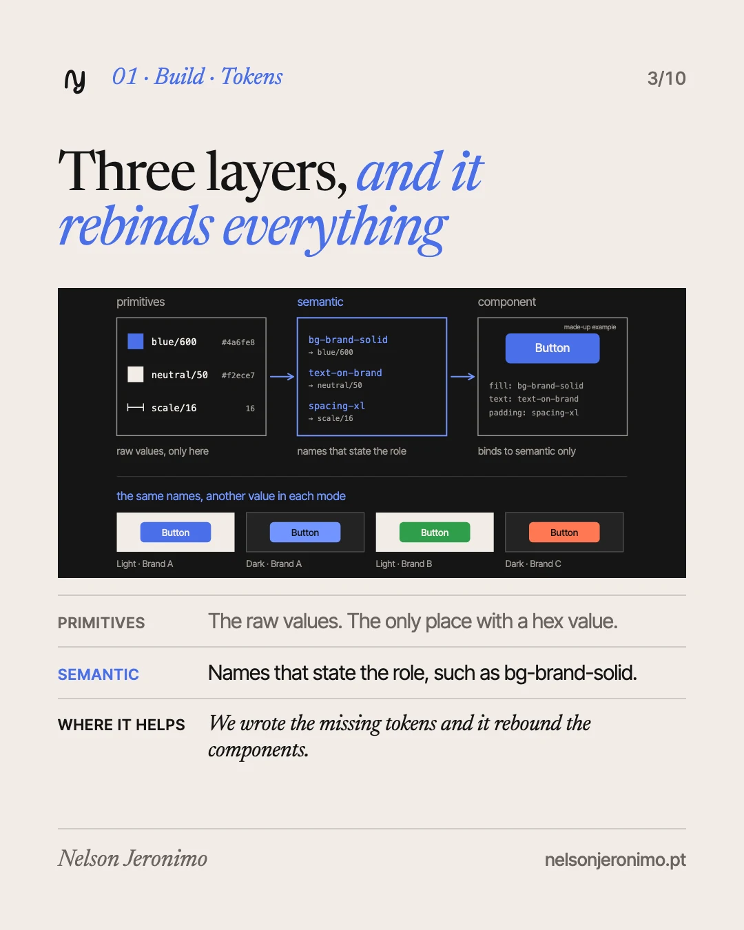
A token is a value with a name. The foundation has three layers, and the rule between them is short:
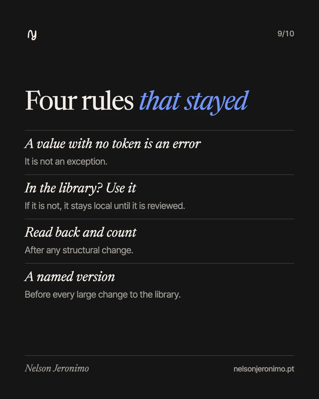
- Primitives. The raw values: the colour ramps, the numeric scale, the type sizes. It is the only layer where a hex value exists.
- Semantic. Names that state the role and not the colour:
text-primary,bg-brand-solid,border-brand. They point only to primitives. - Components. They bind to the semantic tokens, never to the primitives.
In Figma, this is four variable collections: the primitives; the semantic tokens, where light and dark live; the brands, with one mode per brand; and a responsive collection, with desktop, tablet and mobile modes. When the library was published, it had over a thousand variables.
Where Claude helps. In the precise work that repeats hundreds of times. The system started from a base that already existed, and when I wanted to remove the old colour layer there were a few hundred old tokens, of which only a few dozen had an equivalent in our system. We wrote the missing ones and it rebound the components. In the end, dozens of library pages had zero bindings to the old layer, confirmed by a count separate from the script that made the changes.
Why I start here. An agent works well inside rules. With a token for every decision, what it draws comes out inside the system. Without tokens, what comes out is a similar value.
The 4-point grid: it finds what strays
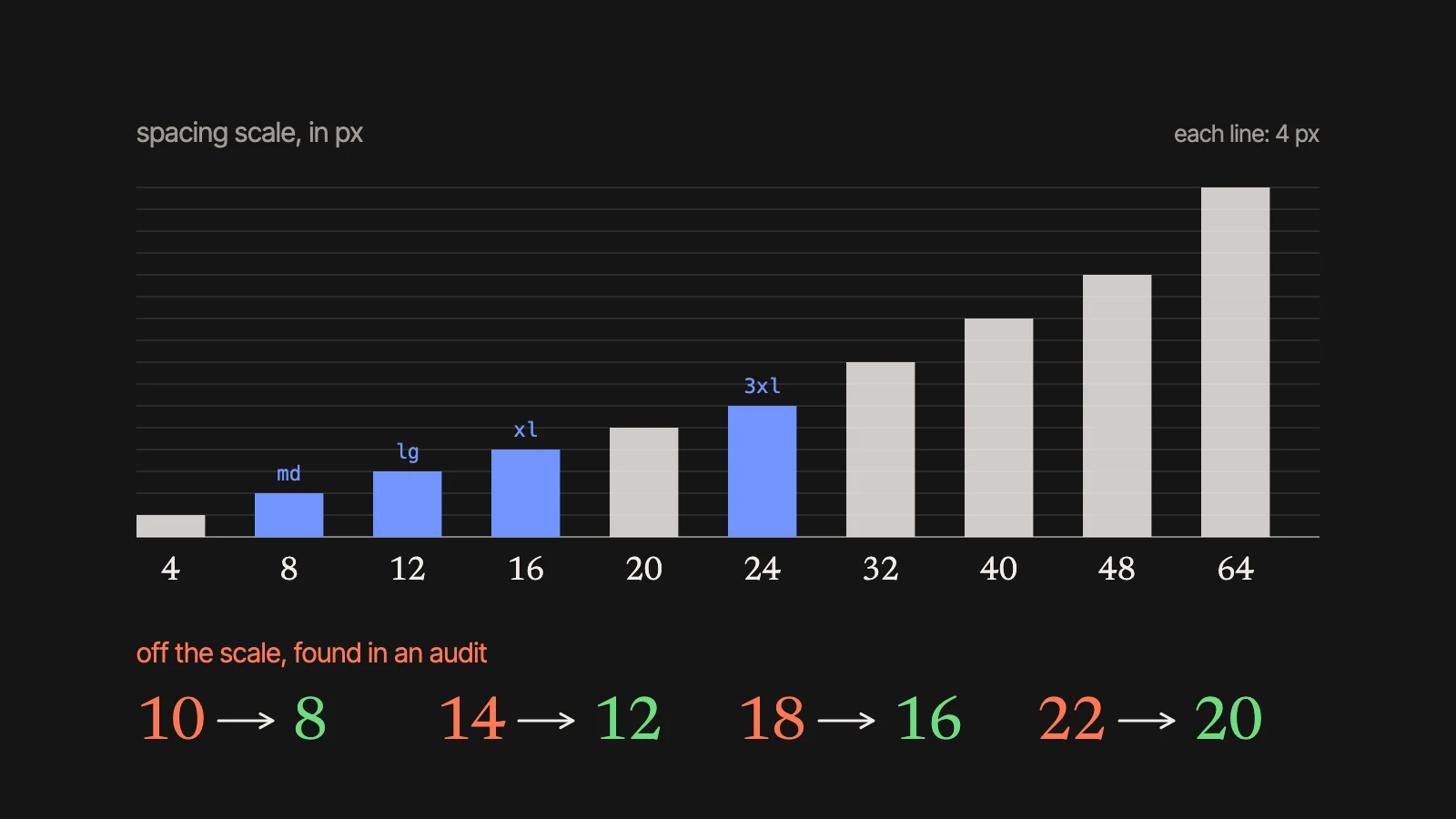
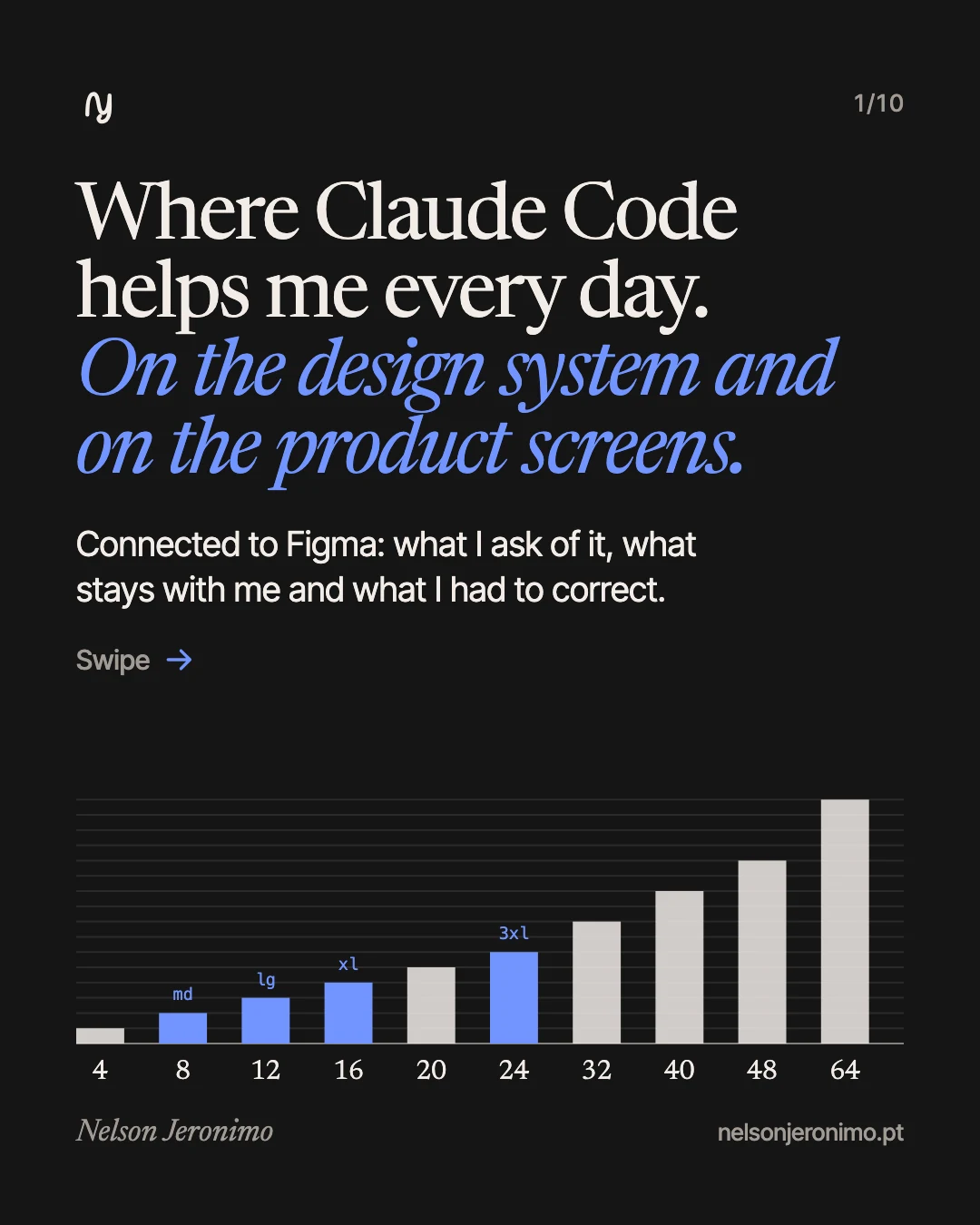
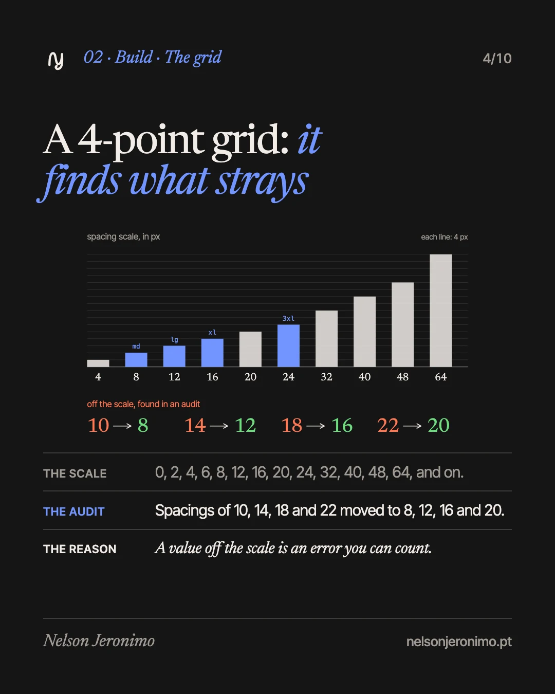
I use a 4-point grid. The spacing scale is this: 0, 2, 4, 6, 8, 12, 16, 20, 24, 32, 40, 48, 64, and on. 2 and 6 are not multiples of 4, but they are part of the scale. The tokens have size names (spacing-md is 8, spacing-lg 12, spacing-xl 16, spacing-3xl 24), and every margin, padding and gap uses one of them.
Where Claude helps. In the audits. In one of them, it found spacings of 10, 14, 18 and 22 in components. None exists on the scale. They moved to 8, 12, 16 and 20, which shifted things by 2 px. A radius of 3 became 2. With a closed scale, a value off it is an error you can count, and counting is what it does fast.
Typography does not follow the grid strictly: 14 text has a line height of 20, and 12 text has 18. I kept the ramp that existed.
Components: it counts the usage and makes the change
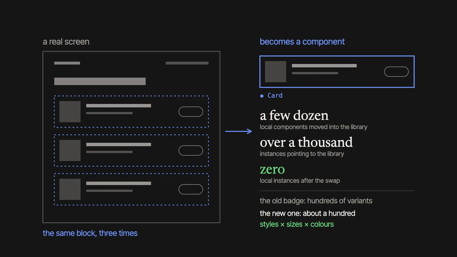
The base components already existed. The product’s own come out of the screens: only once the screens exist do I know how many variants a component needs, and which were never used.
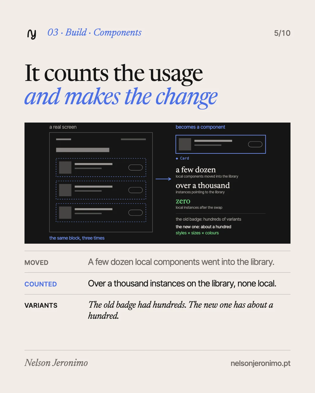
- Moving to the library. A few dozen local components were moved into the library. After the swap, Claude counted: over a thousand instances pointing at the library, and none at a local component.
- Measuring usage. I asked it to read in Figma which components the screens use, and how many times. One of them was placed by hand a handful of times and appears hundreds of times inside other components. It is a number nobody guesses.
- Cutting variants. The badge we inherited had a few hundred variants. The new one has about a hundred: styles, sizes and colours, with a private atom that holds the structure.
- Searching before building. On a single page, we came close more than once to building something the library already had, under a name our searches did not catch.
In use, on the product screens
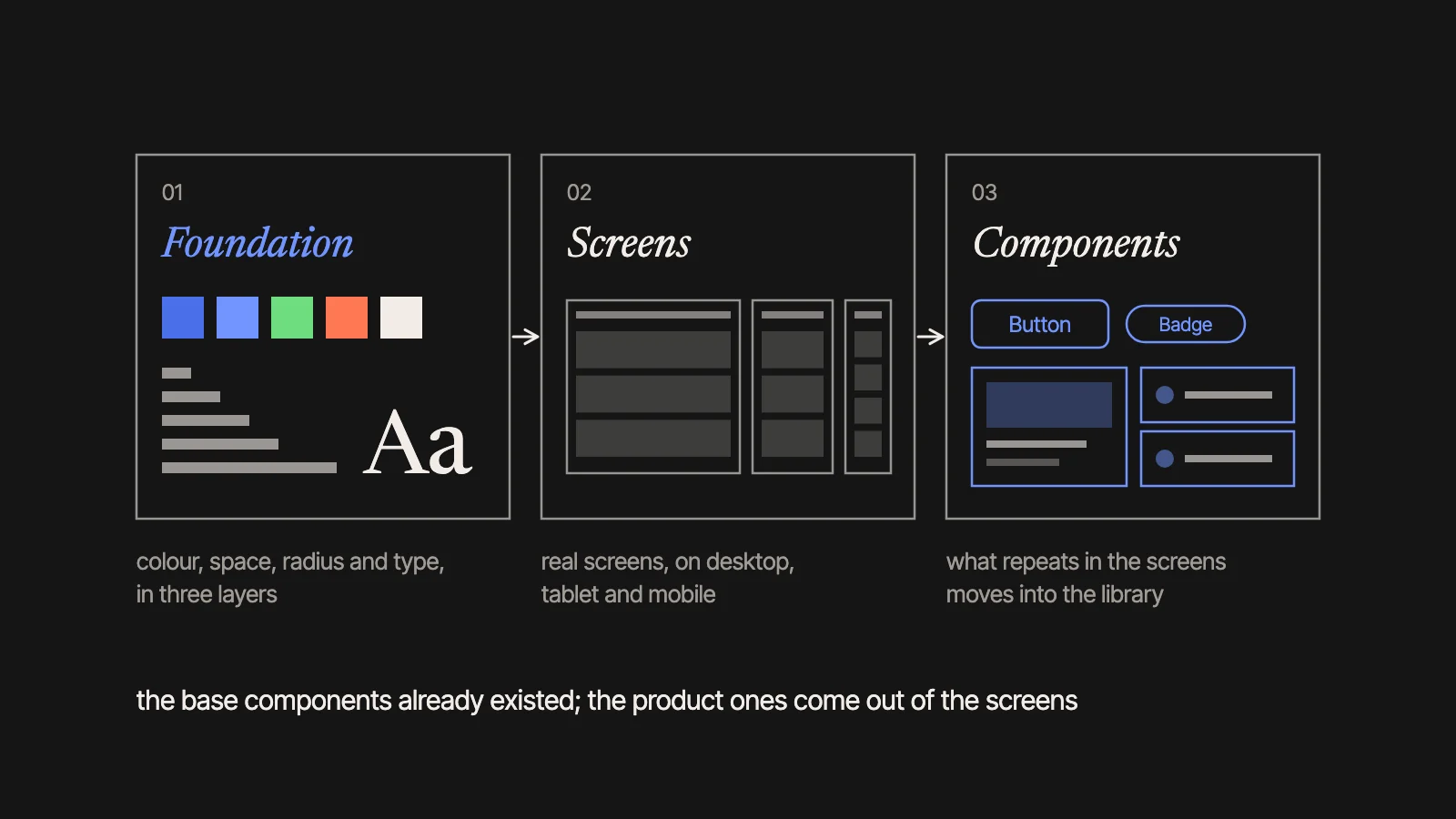
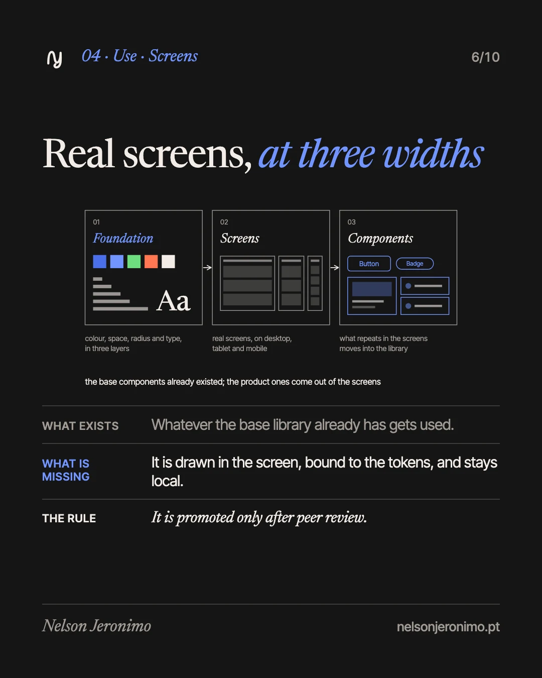
With the foundation in place, the everyday work becomes drawing real screens, with the content and the states each product has, on the LMS and on the ICP, at three widths. What the library already has gets used. What is missing is drawn in the screen itself, bound to the tokens, and stays local to the file until it has been through peer review.
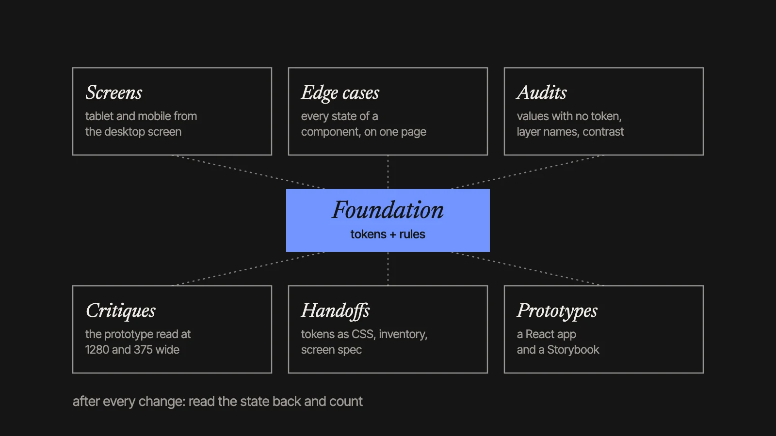
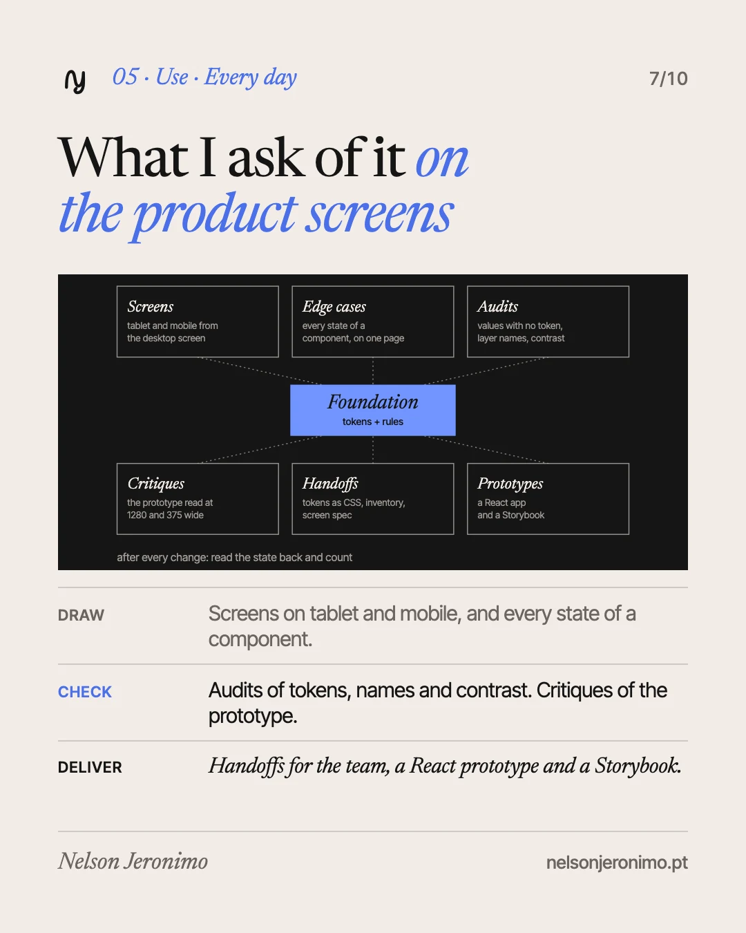
This is where I ask Claude for the most:
- Screens. The tablet and mobile versions of a desktop screen, with the same components and tokens. One of the pages handed to development has over a dozen cards: each screen at the three widths.
- Edge cases. A page with every state of a component. For a question card there were many, and the catalogue was missing precisely the newest state.
- Audits. Counting the values with no token, page by page: one pass gave from none to several dozen per page. Or the layer names: a few hundred, out of several thousand, had the name Figma gives by default. Or contrast: several hundred checks, none failing at AA, with the pairs read from the token file and not from a hand-written list.
- Critiques. A reading of the prototype at 1280 and at 375 wide. One of them pointed out three identical primary buttons in the same view. The fix was one primary action per list.
- Handoffs. The tokens in CSS, the component inventory, the screen specification and the prototype flows. In Figma, the delivery frames are left with no generic names and no hidden layers.
- Prototypes. A real React application, built from that package, and a Storybook. The prototype’s tokens were compared with Figma’s: over a hundred colours across the brand modes, all equal but two. Those two combine colour and opacity, and the comparison could not read them.
Before every large change to the library, a named version is saved in Figma, so I can go back.
What it cost, and what I had to correct
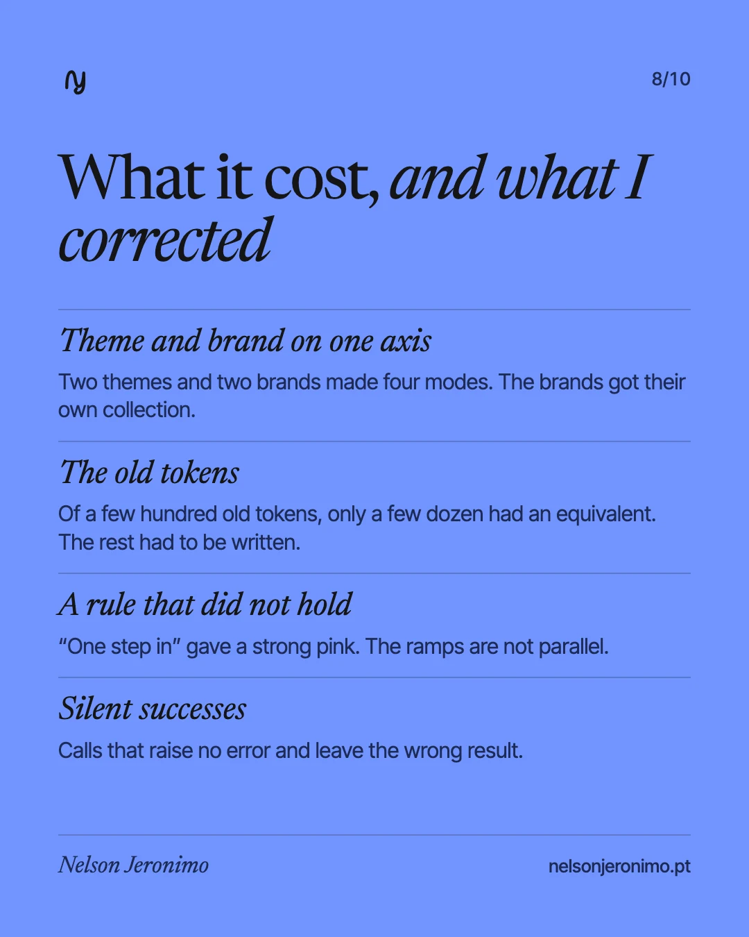
Theme and brand on one axis. In the first version, light and dark shared their modes with the brand: two brands and two themes made four modes, and a third brand would make six. The brands got their own collection. For a while, the brand was expressed in two places, and a component can bind to only one.
What comes with an inherited base. Starting from a base that already exists saves the base components, but brings its tokens. Whole categories were missing: there was not a single token for the disabled state. The old collection could not be deleted yet: ramps and values with no destination remain.
A rule that did not hold. “The secondary sits one step inside the primary” gave a strong pink for error, next to pale tones for warning and success. Colour ramps are not parallel. A rule written as a step number has to be checked against the colour that shows up.
Silent successes. Some calls to the Figma API raise no error and leave the wrong result. Claude keeps a list of dozens. An audit run after a few hours of back-to-back changes turned up several defects, all introduced in those hours. The rule that stayed: after any structural change, read the state back and count.
What stays with me, and what I did not measure
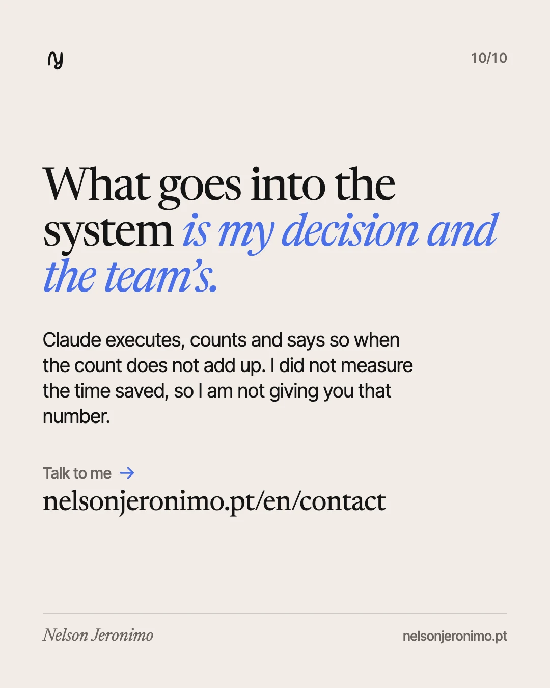
The order, the rules, the names and what goes into the library are my decisions and the team’s. Claude executes, counts and says so when the count does not add up.
I did not measure how much time this saves, so this article does not have that number. What I can show is what became countable: values with no token, local instances, contrast pairs.
If you want to build or tidy a design system to work with AI, talk to me.